Music Streaming App
Project Background
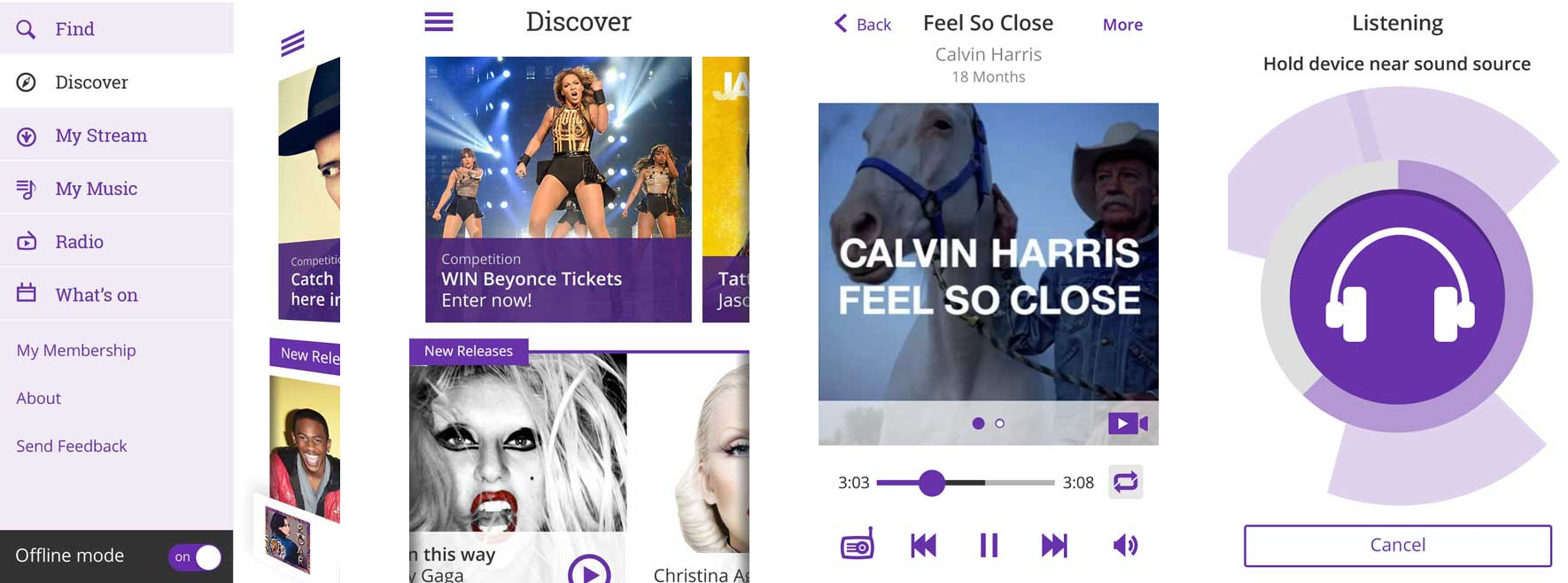
Late 2013, I was engaged to redesign the number 1 music streaming app in Singapore, AMPed. The app’s user experience had not changed since 2011. With the entry of new players in the music streaming marketplace, a redesign of the music experience for the end users of AMPed was required to maintain the user base and increase uptake.
My Role
As the Lead UX Architect on the project, I lead the redesign with a user centered approach. I worked closely with our geographically dispered team consisting of a visual designer (Sydney), the product owner (Singapore) and developers (Hong Kong) to deliver the best possible experience to our customers, on time and on budget.
The vision was create a more current, personalized, and social experience within AMPed.
The Process
Industry Research
I held kick off meetings with the project stakeholders to understand their goals and reasons for the redesign.
I benchmarked AMPed against the main competitors, in terms of features, interaction model, design, transitions, usability and social integration.

Studying the current AMPed information architecture (IA) in conjunction with to the competitor’s (IA), revealed the enormity and depth of the AMPed IA. Content was hidden below up to 6 layers of navigation, making discoverability a challenge. This lack of discoverability was the main driver behind the redesign endeavour.
Market Research
A research program (by the Customer Insights team) had already been undertaken upon my engagement with this project, resulting in 5 customer segments being identified. I narrowed the 5 segments down into 2 key personas/archetypes in order to keep our design focused and relevant.

The main needs of our archetypes were: ease of use (navigation), access to international music, discovery through multiple paths, social integration and modern design.
User Research
I planned and ran research, which tasked 340 users (matching our customer segments) with finding their way through the AMPed 3.0 content tree online.
There was an equal split between AMPed users and non AMPed users (but of other music apps), and the main 16 use cases were covered.
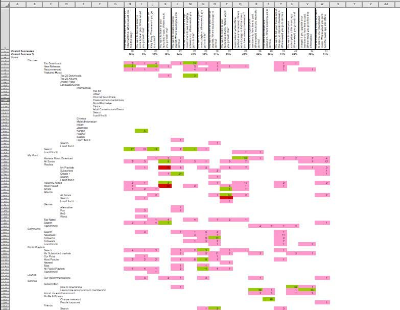
Conclusion: Users could not find their way through the tree, due partly to cluttered labeling. For example within the saved music space, there was conflicting menu items such as ‘My Music’, ‘My Playlists’ and ‘All My Music’. User’s preferred to ‘search’ for a track than to dig deep through layers of UI to manually find it.
The Offline function was hidden below 4 layers UI. International music was hidden below 5 layers of UI.
Information Architecture
From research activity and the study of the current IA in comparison to the competitor’s, it was evident that the new IA must be flattened, content groups reorganised, secondary functions placed in menus (to reduce cognitive load), unused labels removed (to eliminate visual clutter) and multiple paths created for music discovery.

In other words, more content needed to be surfaced, Search needed elevation and integration throughout the app, and social features incorporated all through the listening experience.

Interaction Model
A critical requirement from the business was that the new app UI could be easily redeployed for Android, once the iOS app is released with ‘minimal’ changes to the interface. There was no budget to create two user experiences (a iOS and Android specific).
This and the fact the UI needed to be flexible enough to handle future enhancements lead me to opting for the hamburger menu (left sliding menu), popularized by Facebook. Having tested the interaction models of another 10 music apps in the market place, the left sliding menu was the easiest to navigate.

Concept Ideation
Once I had a thorough understanding of problem I was designing for, I began sketching rough concepts. These sketches aided in internal discussions about the interaction model and helped me quickly communicate my thoughts within my team.
However once I needed to communicate concepts with my remote team (product owner and developers), hand drawn sketches created confusion.
Given we already had certain challenges to work around (such as 3 different time zones), we needed a clearer way of communicating early concepts. So low fidelity wireframes were developed, and through many rounds of feedback developed into 209 high fidelity wireframes.
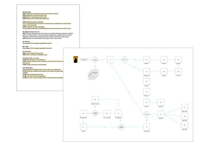
Use Cases & Scenarios
Concurrently to the concepting process, user flows were also created by me. Given I had a global team, I published everything on Google Drive, which helped colleagues stay on top of updates.
I encouraged the whole project team to get involved with documenting any new use cases they discovered along the way, which made everyone feel involved in the process and screens being developed.

Screen Flows
While the wireframes had been ‘approved’ by the project team, I felt the wireframes alone were not communicating the full scope of what we were designing. So I merged the wireframes with the user flows, to show the context of each screen and the transitions between various screens.
This lead to an avalanche of feedback and discussions from the product team and developers, and really got everyone involved in the design process. The screen flows turned out to be a powerful tool for communicating design requirements to developers, who until this date had been occasionally questioning the wireframes.
Collaboration with Visual Design
Parallel to the wireframing process, the UI designer and I worked closely to build the product vision.
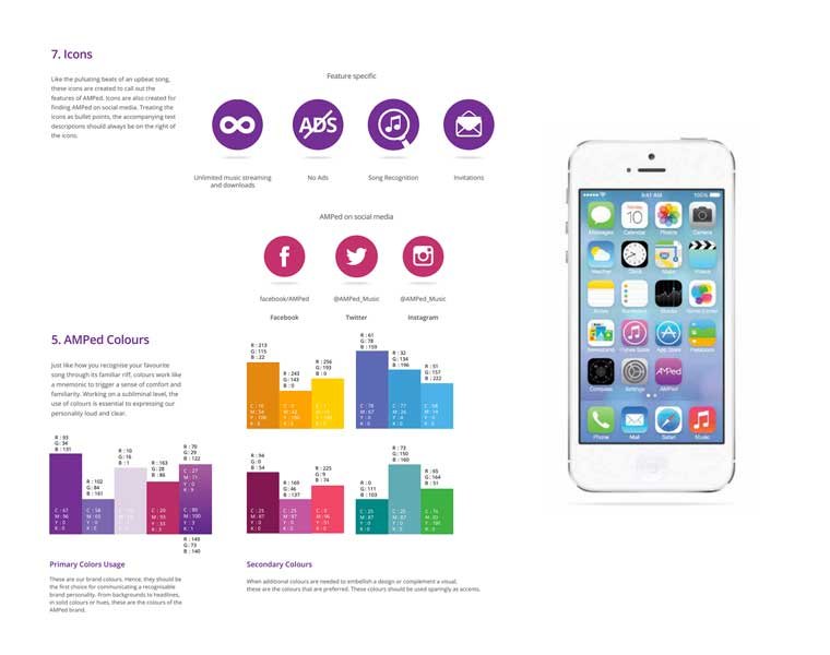
I shared samples of good design (both visual and ux) with her, and she did the same, so that we were always in-synch.
The UI designer would then share her creative direction, new style guide and mood boards, mocking up samples of screens to see how the UI would look and feel. This was a good way of testing the style guide in situ to ensure it would work in practice.
The Prototype
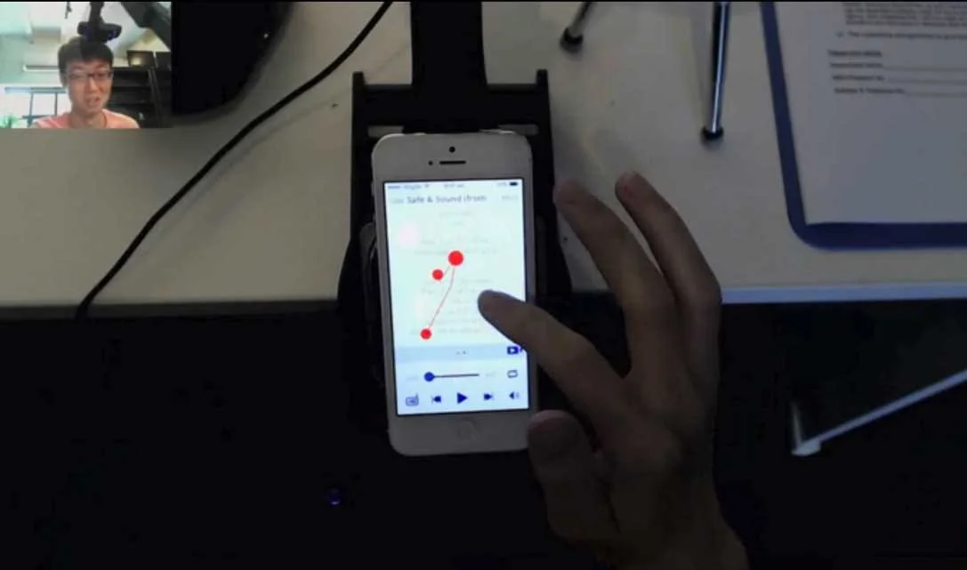
Once the ‘Discover’ phase of the project had been designed, a transitional prototype was built by our front end developer, to test both the user experience and visual design.
User Testing
Numerous rounds of guereilla testing had happened, but our limited budget allowed for only two rounds of formal (external) testing with (Singaporean) users.
For round one, 13 users were tested with the Prototype. For round two, 13 users were tested with the Beta app.
Both rounds revealed small tweaks that could be made to the transitions and interactions. The side benefit of this research was the product proposition and pricing was improved.
Beta Testing & Release
Once the Beta app was ready, I ran through all scenarios and tested the UI to ensure the experience was consistent with my initial design. As i discovered and shared bugs with the developers, they would release another version of the app overnight, which would go through the same rounds of testing.
The app was released in the Singaporean iTunes App store on schedule (August 2014) and is being incrementally enhanced. So far most of the feedback has been positive. Some users were initially questioning the location of their offline music (after we changed the download model), and this has been addressed through Help pages within the App.
“The previous interface was heavy, glad to see is much clean looking now. App performance is faster as well. Great potential, hope to see more improvement coming ahead” - Hoe Zai
“Lots of good new stuff in there with a nice clean design.” - SingAppore
“Love the new user interface, real sleek” - Radical76
“Really excellent update to the interface” - Collymore19