Mobile Wallet
Project Background
Mid 2012, I was engaged to design Australias first NFC payments app (at Optus). NFC was in its early days and the business had grand plans for the Mobile Wallet, hoping “to replace the traditional physical wallet”. The original scope of the project was vast, including in-app shopping, travel cards, housing credit cards, peer to peer payments and more. The ambition was to deliver this product on Android phones and tablets (with NFC) and Apple devices (once NFC is introduced). In addition to this massive scope of work, the stakeholders were hoping to go live on all platforms within 3 months. There was uncertainty across the business (due to structural changes), the project team wanted to work Agile, while the developers (based in South Korea) insisted on the Waterfall methodology, there were additional influential stakeholders (Visa and Heritage Bank) offsite.
My Role
The project team had never previously encountered a user experience designer, and had never developed such a product. As the Lead UX Architect on the project, I facilitated discussions from ideation through to delivery and lead the App design from a user centered perspective. The greatest value I added to this project was assisting the business with the definition and collation of requirements, helping them understand the implications to the user, and how best to marry user and business needs together. All the while educating the group on the commercial value of User Experience.
The Process
Industry Research
There was only a few players in the NFC wallet space at the time, all overseas. I looked at their interaction models, visual design, transitions, notifications and ease of use. Each competitor’s product was different in terms of its offering, so there was very little comparison with our intended product.
Some wallets in the market place were drenched in skeuomorphism which was a direction i wanted to avoid. It took a long time to convince the stakeholders that our mobile wallet was better off without “leather and stitching”.
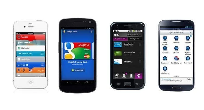
A few months later Google released their wallet with a clean simplified design, which further supported my argument against skeumorphic design. Eventually all the stakeholders got on board and became advocates of clean flat design.
Market Rsearch
A research program in the format of customer focus groups (by the Marketing team) had already been initiated upon my engagement with this project, but I was able to observe the sessions and ask questions.

The concept of ‘tap n go’ with a mobile (without the need for bank cards) was received well, most users loved the convenience. However there were concerns around the security and risk of such technology on a phone. These sessions gave us valuable insights into our users needs.
Persona’s were developed based on this research.
Requirements and User Stories
Due to the disparate nature of the project team and the “feature” mindset of the stakeholders, it was necessary to come to an agreement about the scope and business requirements.
To aid the product owners in the scope definition phase, I developed high level user stories both from the perspective of the customer and the business.
However when it came to the prioritization of the stories, the product owners struggled. It was a conversation no one wanted to have.
So I ran a card sorting exercise with each major stakeholder, which helped them individually come to terms with the scope of work being proposed.
The head of strategy enjoyed the card sort so much, he affirmed “This was very therapeutic and enjoyable, thanks! It helps get my head around the scope”.

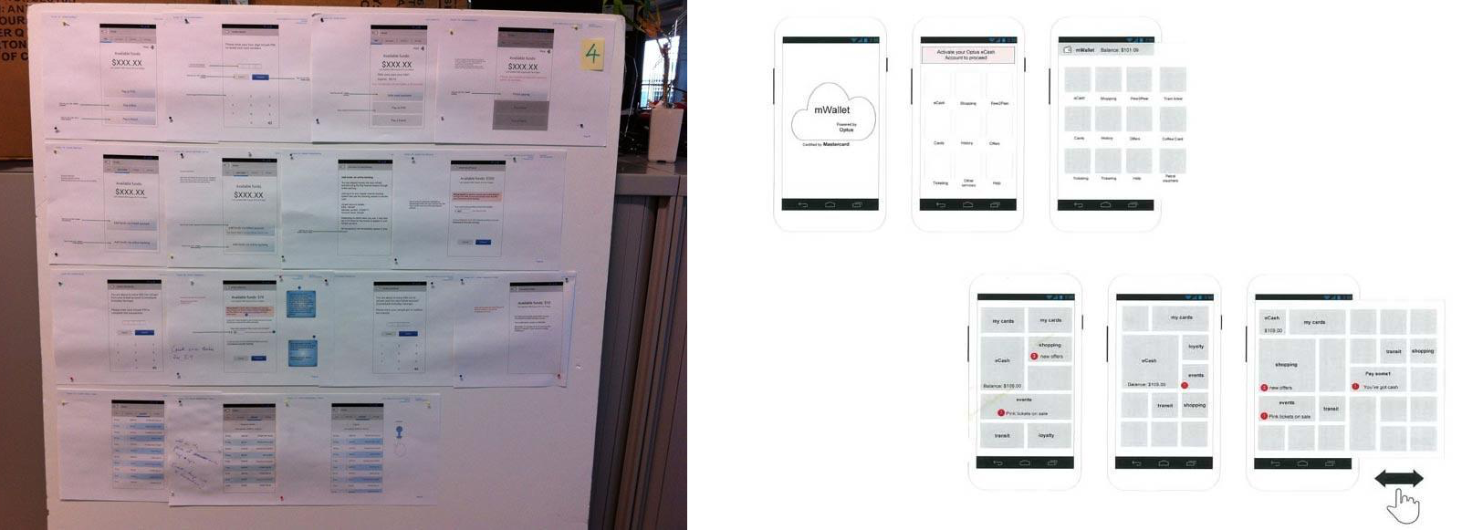
Workshopping Concepts
After the information architecture, I developed quick sketches to help give life to the proposed requirements. At this point there was still no formal requirements, just ideas.
As the business could not agree on priority within the stories, I made a call and began developing those stories into potential screens. I ran workshops with all the stakeholders present, to walk through the screen concepts. Upon seeing the concepts, the different parties identified what their business needs were, and this process helped define the requirements. When clients see what they don’t want, they become aware of what they do want. I then updated the concepts with the new requirements, and walked them through again.
This process proved effective as stakeholders could clearly see their requirements in a visual format and the impact it had for the end user.
Example 1: based on the initial business requirements alone, the signup had 16 steps and took over 2 days to complete. When the stakeholders saw all 16 steps designed in front of them, they agreed to rethink their rules in order to improve the process.
Example 2: based on the initial business requirements the app required the setup of 3 different pins! This was due to Visa and the bank wanting to mitigate risk. While I had repeatedly advised against 3 pins, the stakeholders did not see it as much of an issue, until I took it to the users in testing. From the user’s point of view however this was just not acceptable.
User Research
As no budget existed for user testing, I ran guerrilla testing within the business with interested users (who fit our target audience). About 15 rounds of testing resulted in invaluable feedback and suggestions that helped me reduce the setup process to 6 steps.
User were very vocal towards the 3 pin concept, not surprisingly. After much discussion with various parties on the project, I influenced them into using just 1 pin, and eventually that 1 pin became optional. This new model of use, lead to the product proposition changing, so that less risk was carried by both the customer and the Bank.
My user experience work on this project resulted in Visa rethinking their NFC pin rules, and Heritage reconsidering their dispute resolution processes.
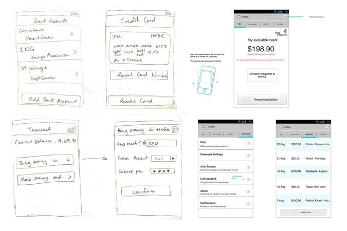
From Concepts to Wireframes
Once the business requirements had been clarified, I developed user flows based on the Use Cases developed by the Business Analyst.
The concepts evolved into wireframes, and as there was no copywriter available for the project, I also wrote the first few rounds of copy. Being a banking product and very unique in the market place, it was important that I design the information copy in a simple to understand manner.
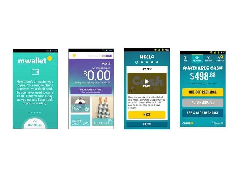
Visual Design
The creative direction of the product changed a number of times during the development phase, due to changes in brand and style guides within the company. I managed the design and closely monitored the visual designers to deliver an easy to use interface, within the style guide parameters.
Beta Testing & Release
Once an early Beta app was available, I tested the product over a few months (from setup to purchases) and communicated bugs and UI issues to developers.
Next we released the app to an trial user base of 30, to get real data and feedback.
Finally the product was released internally to Optus staff of 100 to continue the learning process and refine the experience further.
When the Mobile Wallet was demonstrated at the Mobile World Congress 2014 in Barcelona, we received acclaim for the apps ease of use from competitors within the industry.
Product will be available for Optus consumers in November 2014
Some comments from Optus colleagues:
“At the 2014 Mobile World Congress, I showed the App to Visa Inc/Europe, Mastercard, Caixa Bank, DeutscheTelecom, Orange , Telenor and they all loved the App – great UX, focused on speed and simplicity. Clear, fast access, minimum number of taps, focus on real time balance etc…and most importantly the ability to pay without starting the App.
Well done Fay, this is a great piece of work, I am sure Optus customers will love it like we do.”
Director – Digital Payments
“Informal comments about the product usability, both in App and other areas when demonstrated at the Mobile World Congress, underscore the positive contribution from Fay.”
Head of Market Development – Digital Payments
Awards include
ACOMMS – “Best Vendor Innovation 2016”, “Best Mobile Solution 2015 and 2016”
World App Design – “Best Fin Tech, Best New Service/App, Best Connected Device and Wearable Tech 2016”
ADMA AC&E – “Best use of New Technologies 2016″
Finder Innovation Awards – “Best Mobile Payment Service 2016”
The Outcome

Launch Ad