Mobile First Media Website
Project Background
When I joined Nova Entertainment in August 2018, their websites had not been updated for many years. The visual design and typography was outdated, the spacing was off and the user experience was bad; for example listeners were encouraged to sign-in to listen to live radio, however the signed-in and signed-out experience of the website were identical. There was no additional benefit from logging in and furthermore once you logged in, there were no account features (such as change of password).
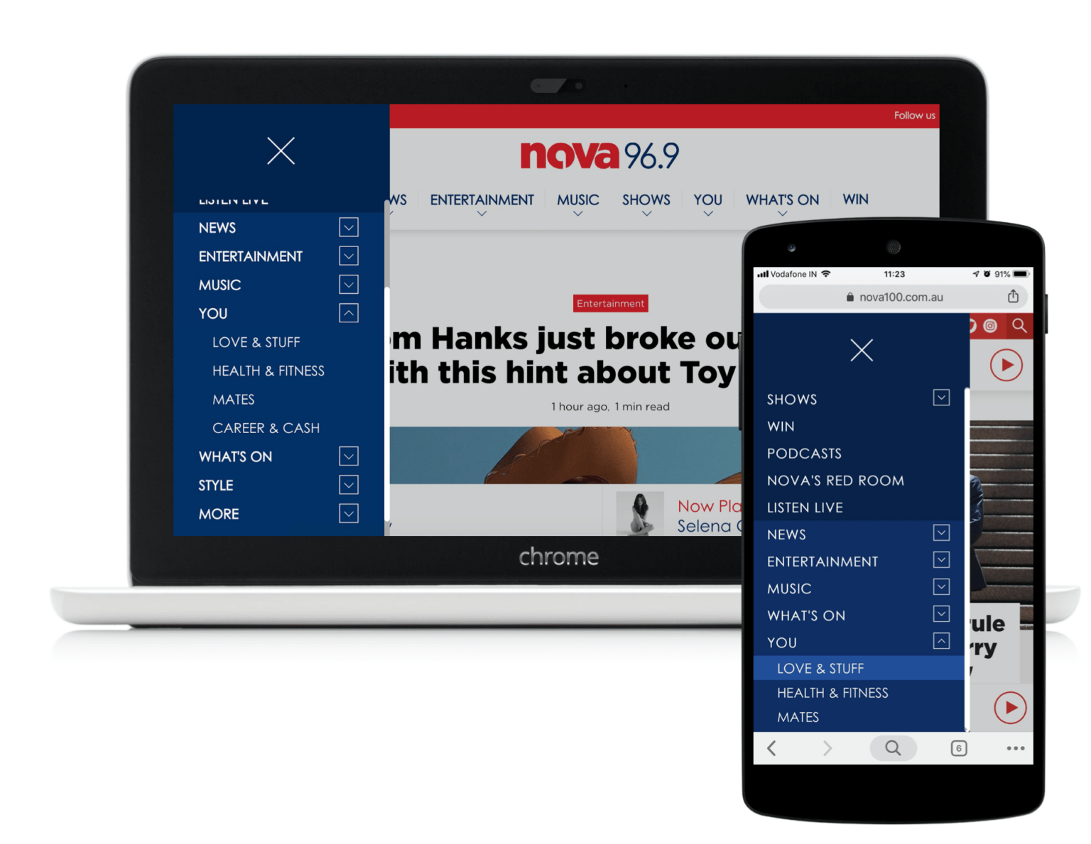
Discoverability was a challenge and a review of the content revealed information architecture issues and content on home pages that were out of date; for example the Smooth homepage had articles with timestamps from 2 years before. There were even 2 concurrent navigation menus on the Nova site, one mobile hamburger menu and one desktop, each with different content.
It almost seemed like the website design had not been completed before going live.
I was tasked with redesigning the website in only 5 weeks, as the external developers (XWP) were scheduled to begin coding. This meant we had very limited time for the exploration and research needed to arrive at a final solution that was user tested. Another big requirement was for this design to work across all of Nova Entertainment brands (Nova, Smooth, FiveAA, StarFM and Goat), with just a visual refresh. As a UX practitioner, I know very well that you must design for the content you have, and each of these brands had varying amounts of content and sometimes very different content. For example, FiveAA is predominantly a talk show station and doesn’t produce much written content, whereas the Nova website has a large editorial team producing copy. Smooth has little video and podcast content, which is a major feature of the Nova brand. These business requirements in conjunction with a tight timeline meant that we needed more designers in order to deliver the polished designs within the 5 week timeframe.
My role
I was the UX Lead on the project and in my team was Praveen KG (Nova UX/UI designer) and three other designers from an external agency. I was both the stakeholder for the agency and a design colleague helping with the successful delivery of the project.
THE PROCESS
Competitor Research
Before engaging the agency, the Nova UX/UI designer and I began to look at our competition for insights and ideas. Through this research we developed a good understanding of what we didn’t want for our website.
Onboarding the Agency
In order to build out the design team for such a short amount of time, I decided to engage a UX agency I had previously had good experiences with. They were reliable and had a track record of delivery, as well as fitting within our budget.
We had the usual kick off meetings and I briefed them on the challenge, the business needs and what the project sponsor wanted to get out of the engagement. We developed a scope of work and I began scheduling stakeholders to attend workshops I was planning.
Stakeholder Workshops
Because there were many stakeholders across the business and from various markets, I broke the stakeholder groups into Programming & Marketing, Create (internal Nova ad agency), Sales and Digital Commercial. Each stakeholder group had very different viewpoints so it was critical to collate their needs and wants as well as to make them feel heard. At this stage I was still new to the company and it was critical to build trust with colleagues. Most had never been engaged in previous redesign projects and were frustrated by the state of the website, claiming it didn’t meet their needs.

One such stakeholder group was the digital commercial team, who had a vested interest in the website capability when it came to ad placements and commercial takeovers. Through weekly check-ins with the digital commercial director, my team and I built out the ad placement requirements which would ultimately determine the layout and grid of the website as well as the location of the player.
Concepting
The three designers from the agency became very embedded in our team, and I worked alongside both as a stakeholder and also a colleague to help build out the various concepts to be explored with users.
One requirement from the commercial team was to move the radio player away from the footer so that this space may be freed up for ads (bold banners, sidekick and anchor formats). Given the range of new features we had in mind for the player (such as the ability to play podcasts and news briefs, rate tracks & track info etc), we knew the player needed to expand and contract somehow. Expansion was required to house all the additional audio functions and contraction was necessary in order to not obstruct the reading view of the user.
The website needed to house a lot of written articles, videos, podcasts as well as live radio streams and flash news briefs. All of this coupled with the fact that 90% of our audience were mobile users meant that not only did the website have to be mobile first, but the player had to be optimised for mobile browser use.
As we went through the concepts, everything started to come together except the interaction design of the player. There were too many conflicting requirements for the website and none of the approaches we tried for the player worked for every scenario.
Time was running out and we needed to have a solid solution to go to testing with the next day, so I convened all the designers in a room (including one designer who worked remotely via a Slack call) to come together and sketch out as many interactions and possible solutions.

Nothing would be judged or criticised, it was purely an exercise to get as many ideas out as possible. Within a few hours, we were able to build on each other’s ideas and come to an interaction model that worked from a UX point of view and also enabled the commercial team to place their valuable ad inventory. And finally we landed on an alternative location to house the player that met the users’ needs as well as the business.
User validation
Validation of the design with actual and potential customers happened in the agency’s testing labs in Melbourne as well as the City Group Rooms in Sydney, which I invited a wide range of stakeholders to attend. The sessions were also live streamed so that stakeholders who couldn’t be there in person were able to tune in and watch from the office. For most stakeholders it was the first time they had seen customers interact with their product and hearing honest opinions was eye-opening.

The way I encourage my stakeholders to get involved in the customer feedback sessions is by taking notes and “insights” on post-it notes and sticking them on the relevant designs, which I previously printed and attached to the walls of the observation room.
Through the testing process we were able to refine the design and eliminate ideas that didn’t gel well.
Detailed design
By this stage of the project, our time with the agency finished and they handed over the design files to my team to build on. While I consider our agency engagement a positive experience, we still got together as client and consultant to do a post mortem and discuss how we could improve the process next time. I believe this is a very healthy way to end an external engagement, and I highly recommend it to other organisations.

The designs needed to be fleshed out into multiple permutations as well as phases, as Engineering could not implement everything by the set go live date. It was a collaborative exercise across multiple teams (Engineering, UX and Product) to split the designs into MVP and post-MVP. We then proceeded to export everything to Zeplin and walkthrough with the engineers so that they knew clearly what to implement next.
The most challenging part of this redesign was actually designing for numerous different ads, each with its own size, location and behaviour requirements. As a UX practitioner, I found myself in a dilemma because I know users don’t like ads and they really hinder the customer experience. But at the same time, the Nova website offers a free service (radio entertainment) and must recoup its costs so advertising is non-negotiable.

The way I addressed this issue was to prioritise the placement of higher revenue generating ads and negotiate with the commercial team to remove ads that don’t add much commercial value. It was a fine balancing act between the customer needs and the business needs.

The final step of the design process was to build out the various brands’ websites each with its own brand guidelines and unique content library.
Delivery
The build and delivery of the websites were made a lot easier by having our software engineers in-house. I was able to sit with the UI dev to work through the design and refine interactions and any issues would be rectified in a timely manner.
Outcome
The websites were launched successfully on time and the editorial team were able to transition to the new WordPress platform seamlessly. Due to the tight timelines, the events and analytics needed to measure the success of the website redesign could not be implemented straight away. They are now scheduled to be implemented by the end of 2020 so that user insights can be collected for further refinement of the website’s design.
