CommSec Pocket Investing App
Industry Context
Traditionally, customers were required to invest a minimum of $500 into a parcel of stock, as stipulated by the ASX. Along with expensive trade fees this created a barrier to entry, and research revealed that less and less young Australians were entering the stock market.
Our aim was to reduce the barriers of entry for Australians who are considering investing, by lowering the entry costs and simplifying the process.
While this sounds logical, we faced numerous challenges given the industry is heavily regulated by APRA and is not accustomed to product innovation.
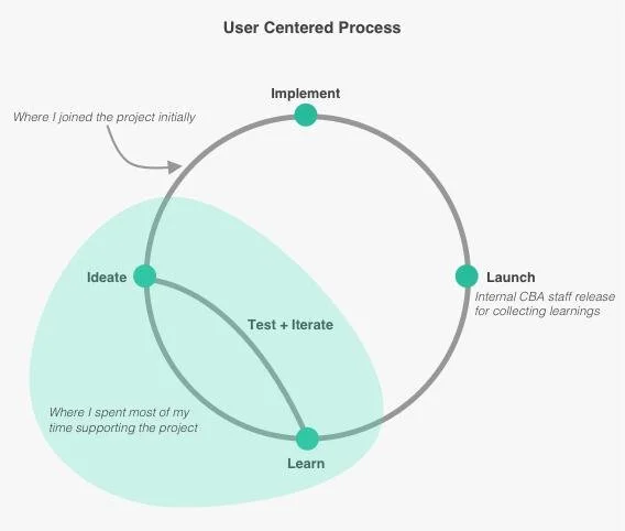
My Role
The program sponsor initially placed me on the project one day per week in a consultative measure – to ensure the smooth delivery of the UX work by the external agency. Given the large financial investment in the project, it was essential to have someone with solid Mobile UX experience acting on behalf of CBA in this engagement. However my role very soon became full time as the coordination became much more complex than anticipated.
There was a significant disconnect between what the agency promised to the delivery team, and what was actually received. The expectation was that we would receive final polished designs ready for development – instead we received a working Sketch file which was poorly set up, with no explanation of how to review the UI specs. I subsequently encountered mobile developers opening the Sketch file to try to determine size and colour of elements on the screens.
So the challenge in this project was different – unlike other projects where I could start with a clean slate, I was given the MVP designs, user tested but somewhat incomplete. My focus became finishing the UX work, cleaning up the design file, enhancing the visual design and helping the software engineers begin dev. Once the dev work began I started to build out the non-MVP features of the app, working with the branding agency and marketing to define the visual language of the app. This became a very large project and I focused on this app full time for a year.
THE PROCESS
Understanding the Problem Space
Having started trading myself a year prior, I was well aware of the pain points that a novice investor experiences. Firstly, originating (signing up) a trading account was a difficult and long process. Secondly, with over 2000 stocks in the ASX, how is a beginner to know which stock to buy first? Next comes the immense technical knowledge required to understand markets, their volatility and the comparable risks of each stock. And finally, the CommSec platforms are very feature-rich and complex, making it difficult for a novice to learn their way around. I was able to use the knowledge I had gained personally, combined with previous customer research run by an agency with new investors, to get a solid understanding of the problem we were trying to solve.
Market research
There was a trend overseas of simple investing apps with – what was perceived to be – lower trading fees, however nothing existed in the Australian market. I looked at many investing apps that claimed to solve the same problem but further investigation revealed that was not the case.
This made it evident that there is nothing comparable to our vision in the market.
UX and UI refinement
Once the agency delivered their designs, I took over the UX/UI work and discovered that the Sketch file which had been provided to the mobile developers was in a chaotic state. I initially thought it would be as simple as exporting all the screens to Zeplin. However when I took a closer look at the design files I found numerous inconsistencies. These were not final polished visual designs but coloured wireframes! For example, after running a colour check plugin, I found the previous designer had used 167 colours in the file and 57 of these colours were different shades of the one grey. In producing the design file, correct file setup and the importance of a limited colour palette were not considered by the agency.
Furthermore no elements in the Sketch file were symbolised, common UI elements across multiple screens were not aligned or even in placed in the one spot. This meant that if developers had coded the screens based on what was given to them, the user experience of the final app would have been a complete mess, with colours changing from screen to screen, and buttons and text jumping around!
At this stage the brand of the app was still being developed and fonts were yet to be purchased, so it was a good time to manually update and symbolise UI elements on all 150+ screens in preparation for the final brand drop.

Once the designs were in working order, I exported the current MVP screens to Zeplin and walked the developers and delivery team through them. This meant that when the PO needed a change in copy based on feedback from Legal or Compliance, I was able to instantly update the designs for our devs, which helped speed up the team immensely.
In the meantime I began to focus on the interaction design of the post-MVP screens. My business owner and marketing manager wanted to be involved in the visual design detail, and given the very limited brand colour palette we had to work with (yellow, charcoal and white), I explored multiple variations of the one screen in order to land on the best one.

Additionally our legal team insisted on only giving feedback in situ which effectively meant I’d have to update content and copy in Sketch numerous times before Legal, Compliance and Product came to an understanding. Once the end to end experience of the app was defined and designs looked ready enough to be tested, I championed further user testing with the business owner.
At this point in the project, all our design funding had been spent on the agency engagement so I needed to find another way of getting customer feedback. My approach was to engage the CBA graduate program as this pool of people were a very close match to our target demographic. This proved to be a very effective strategy, as through the many sessions of testing I conducted, we were able to further refine the interaction design of the app.

Conclusion
CommSec Pocket makes investing simple and accessible. The investment options were carefully selected and refined, the brokerage fees were drastically dropped and the user experience was carefully planned and designed to facilitate learning throughout the customers journey into investing.
In one year, over 100,000 accounts were opened via the CommSec Pocket app and over $180 million was invested.
The app was recognised by Canstar for innovation excellence in 2020. Canstar’s judges described it as “market leading”, with considerable “wow factor”. The judges said the innovation could potentially lead to other providers looking at ways they too can help investors of the future.
The app won the Commbank CEO award in 2020 and has received a lot of positive industry feedback and press, including; “CommSec Pocket leads the industry in terms of overall satisfaction, while Stake and SelfWealth came in second and third, respectively”.
Promotional Video