Redesign of Multiple Radio Apps
Project background
The previous Nova mobile app was several years old and had been designed to replicate the content on the old website, making it somewhat irrelevant.
A quick review revealed many navigation problems such as not being able to find many podcasts. Information architecture problems within the app meant that the business could not publish content easily. Furthermore interaction design issues made simple tasks such as starting and stopping podcasts a challenge. Negative reviews in the app store were reflective of user sentiment.
A heuristic evaluation of the app revealed a myriad of improvement opportunities which made the case for a redesign very easy to sell to the business.

My Role
I was the Lead UX on the project and worked very closely with the UX/UI designer (Praveen SK) to carry out customer research and design the final user experience. In this project, our developers were remote and working through an agency. This agency followed waterfall development processes so it was crucial that all our designs were customer tested and pixel perfect before they began. The smallest change would cost us a lot of time and also money.
The Process
Competitor Research
The product manager, UX/UI designer and I looked at both direct competitors and also indirect competitors to explore as many different ideas and approaches as possible. This exploration was necessary as it enabled us to later refine the UX strategy of the app to better meet our business objectives.

Stakeholder Research
After getting a good grasp of the competitive landscape, I began interviewing major stakeholders to understand their needs and wants for the native app. Unlike the website redesign project we had also completed at Nova, the native app had substantially less stakeholders to engage and we were able to go through this process in a quicker fashion. One major stakeholder group was the Marketing team who wanted to ensure the app was designed to best reflect the brand.
Product Strategy
Having just completed the redesign of the Nova websites to be mobile first, it was crucial to differentiate between the strategy of the native app vs. the mobile website.
Why would a user need our app to read entertainment articles when they can accomplish the same task just as easily through the mobile website? I worked very closely with the product manager to define the strategy of the native apps. The business saw opportunity in better targeting ads if the identity of the users were known, which brought personalisation and authentication into the roadmap.
The content of the native apps were narrowed down to podcasts and video content as well as radio streaming. This was the most valuable content for the business and could be monetized with the highest ad revenue.
Iterative Design
We had discovered from the website design project that the radio player was likely going to be the most challenging part of the interaction design. This was once again due to various business and customer requirements such as:
– displaying the current show and track info
– letting users like/dislike current tracks
– letting users go back in time to view tracks
– being accessible from everywhere in the app and every state
– housing podcasts and podcast controls
– housing news briefs and relevant controls
– being expandable and contractable
We explored the various locations of the player and how much or little to show the user in the expanded/collapsed states. There was also a requirement from the business to make the app landing page a ‘radio’ landing page, so that the show content could be easily interacted with. In addition the various DAB stations needed to be easily available to encourage users to explore more than just our FM offering. All of these elements led to the designs being refined and iterated a number of times before customer testing. By the time we reached customer testing, we had a design we felt comfortable with which was meeting all our business needs. Normally with larger budgets I would have customer tested earlier on in the design process but in this case a very small budget meant I had to choose the optimum time to test with actual customers.
Customer Research
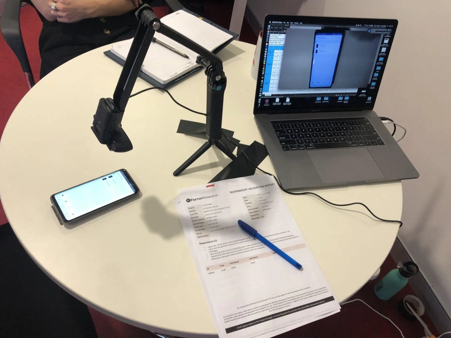
I facilitated user research in-house to keep costs low, using a temporary camera setup. However I opted to hire actual customers and potential customers in order to best validate designs and product direction. This proved to be an effective strategy, and the money spent on customer recruitment returned dividends.
To my surprise, user research revealed that customers would be happy to sign into the app in order to access the content. In fact most users thought logging in was standard practice in other media apps and had no reservations about signing into the Nova app–provided a range of login options were available.
Detailed Design
As the developers were offshore, we took a number of approaches to clearly explaining the app designs and interactions with them. These included sharing design specs using Adobe XD, interactive prototypes, videos of microinteractions and screen flows. The goal here was to provide as much design detail to the agency as possible as we had to go through an account manager and the developers were often not in direct contact with us.
The UX/UI designer in my team even went as far as specifying the exact microseconds that the app coach tips should be displayed to the user, to ensure the developers matched our designed experience as much as possible.

Build and delivery
Most of the build was managed through Jira tickets between our team and the mobile dev agency. All UX bugs were raised here and mitigated as quickly as possible. Despite this, the build of the app took far longer than it would have if it had been developed in house. The time difference between the UK and Australia, in addition to having an account manager communicate between our team and the dev team made the process more challenging than it needed to be.
Outcome
The app was delivered on time and we received a lot of positive feedback from users via our social channels and app store reviews. The business now plans to bring the dev work in-house so that we have more control over the build time and quality. The UX enhancements such as animations and microinteractions that couldn’t be implemented by the external developers will also be built in-house. Due to the costs of external developers, initially we were not able to implement the polish that I had planned for and I believe the strategy to bring the development in-house will better facilitate this.
