CommSec Platform Redesign
My Role
I was headhunted by CommSec to lead the UX of their platform upgrade project. This was a huge program of work across 2 years with a budget of $25 million. My focus became the design of critical self-service capabilities so that customers could manage their accounts, while reducing manual work for back office staff and call centre contacts.
Business Context
When I started with CommSec, I found their feature-rich platform was difficult to use, looked stale and wasn’t responsive. Meanwhile their competitors were busy upgrading their platforms and investing in better user experiences.
In addition, I discovered after joining the team:
– UI design: Wireframes and visual designs were being created in MS Visio, rather than industry-standard design tools.
– User research: Sporadic internal guerrilla testing was carried out with highly specialised trading staff. No thorough customer-facing research was in place.
– UI development: Backend developers were tasked with UI changes as there were no UI developers on the team, so a simple front end fix on the site would take weeks to get right.
Design process improvements
Given this was a multi-million dollar project, it was never going to be successful if the right skills were missing. I championed the hiring of 2 UI developers and a UI Designer, and outlined the risks of not doing so. I also pushed for the right tools to be purchased and demonstrated the efficiency of designing in Sketch and exporting to Zeplin instead of writing design specs on paper. This made our design team 70% more efficient in turning around design solutions.
I also enabled stronger collaboration between the separate CBA and CommSec UX teams, and we were able to leverage assets from the CBA design library.
The next challenge sat with the dev teams. We had 10 scrum teams, and they were previously used to receiving the final visual designs in PDF format. Some developers expected PDS files, which they would open in Photoshop to work out the design specifications.
The development team did not know about Zeplin, so that was another bridge to cross, to make them see that exporting Sketch files to Zeplin is more efficient than the old ways of working.
Once experienced UI developers were hired, they saw the efficiency of receiving UI specs through Zeplin, and they became advocates, eventually even acknowledging it’s twice as efficient.
Agile within CommSec
I faced a unique challenge with this project. Whereas in most agile organisations the inception is usually the project kick off (where you start discovery before moving into research and design), in CommSec it is assumed that the dev team can begin implementation immediately after inception. As a result, I was expected to deliver the final polished designs at the inception of the project.
There was no room for negotiation here as we had tight timelines and even tighter budgets (set a year prior to program beginning). I knew that there was absolutely no opportunity for change in the designs beyond inception day and no room for error in UX.
The solution I proposed to the program sponsor was to adjust our approach and to begin the user research and design months earlier than initially thought.

This was going to be demanding from a UX practice point of view but it reassured my stakeholder that I understood the business’ needs.
Another concern raised by the business stakeholder was based on previous experience with designers. He felt they disappeared into design studios for weeks, only to come back with a design solution that the business was not confident in.
The way I solved these problems was to engage the tech team (solution architect, BAs, scrum master, testers), product, program and customer experience manager as early as possible. Everyone was given weekly walkthroughs of the concepts as they evolved into detailed designs, with ample opportunity to give feedback and raise concerns. This meant that I had the buy-in of the delivery team from the start.
They were all invited to watch the user testing of the designs and could see clearly where the final solution had come from. This evidence based approach to UX helped the business see the value of HCD and their ROI.
The Process
Understanding the Problem Space
Having never traded before, I began by understanding the problem space better.
The very first step in learning about the customers’ pain points is going through their typical journey and documenting the process.

This included originating my own trading account (signing up) and taking screenshots of every step. The sign up process was so long and difficult, I could not complete it without the help of a colleague sitting next to me, explaining the jargon. Once signed up, I struggled to use the platform without constant assistance, which was all very useful information for our redesign.
Industry Research
It’s important to see how competitors deliver their origination and various self-service features so I completed the same tasks with major competitors, and documented that process in detail.
Field Research
I interviewed the back office, and watched them complete tasks which could be digitised. Very little self-service capability existed.

Even simple tasks such as a change of address or bank account required the user to print a form, fill and certify it, then post or scan it in. It was eye opening to see the back office staff would actually then print out the scanned forms from users (or open letters posted in) and manually update their systems. This was inefficient and had room for human error, not to mention that back office staff wanted to do more engaging and value adding work.
User Research & Concepting
When I joined the project there were already well researched Personas, which I was able to leverage for user testing recruitment. There was also a series of Customer Journey Maps delivered by a research agency prior to my engagement, which outlined the journey that users took to fulfil their self-service needs. These were valuable resources I drew on to build the early concepts which I later took to customer testing.

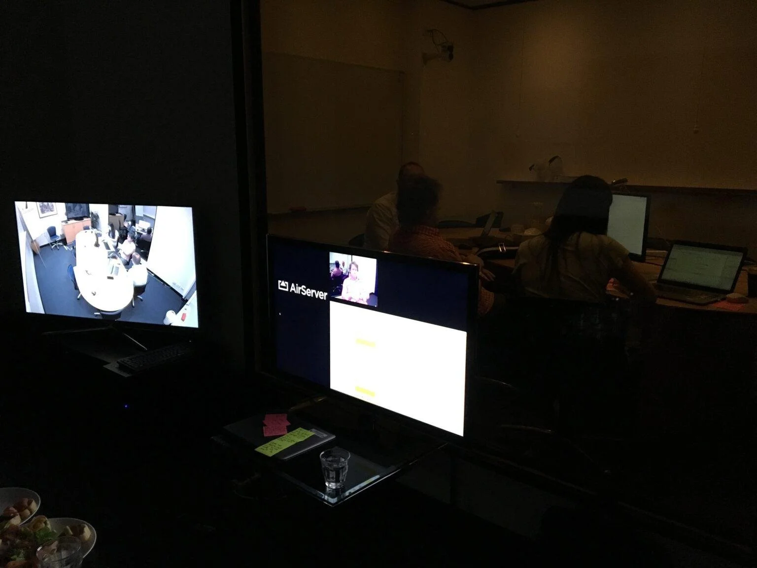
I brought in a usability agency to help with numerous rounds of customer testing while I was focused on iterating the design. Over the course of a few months, we went through several rounds of user testing, which helped refine the designs from low fidelity concepts to high fidelity prototyped designs in preparation for inception day.
A few quotes from users during the final round of customer testing:
“I don’t know who wrote this design, but the process is so simple and easy to use” – Pamela, 66
“It all looks very straightforward and easy to use” – Gavin, 50
“It’s fairly intuitive to update my details” – Kate, 43
“That was heaps easier than filling out a paper form” – Jay, 32
“That’s what I expected, it’s very intuitive” – SK, 38
“I wasn’t expecting it to be that easy actually” – Anthony, 40
Detailed Designs
At inception, the tech team were all quite familiar with the designs and already knew the solution was feasible because they had been engaged throughout the design cycle.
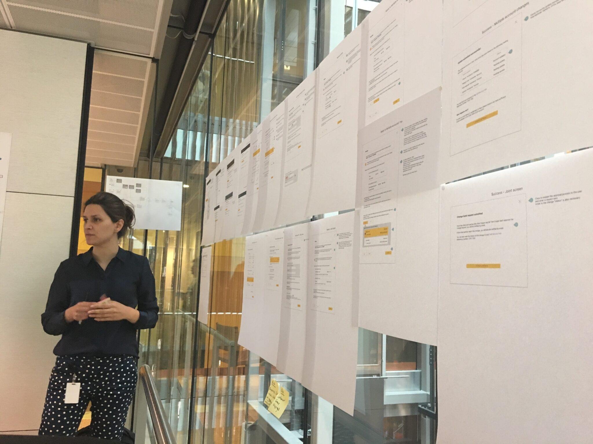
After inception I exported all designs to Zeplin and shared these with the wider delivery team. A few times a week I sat with UI developers to discuss any questions they had and to help build out the screens.
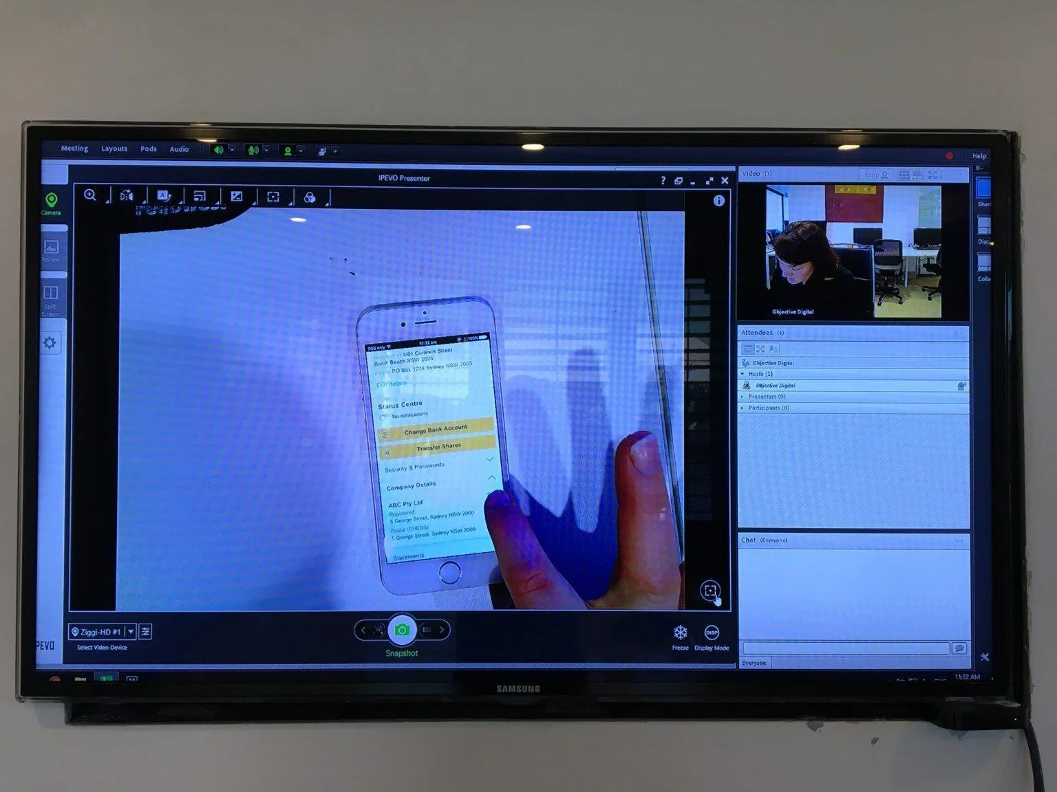
Example Prototype of Change of Bank process
Project Conclusion

The self-service program of work was successful. We had an 80% adoption rate by customers once the self-service features were released online.
The business saw a significant reduction in paper handling by the back office, as users could now update their details securely within a couple of clicks. 90% of all self service requests became straight through processes and did not require any manual interaction from staff. Also 70% less paper was used.
We effectively doubled the number of customers who were successfully converting their stock, with a reduction in rejection from 48% to 18%.
Prior to our project, 50% of calls to contact centres were from customers needing to retrieve their client ID, which they could now accomplish themselves. This led to a further 30% reduction in contact centre load.
The success of our team was recognised by the business and the EGM awarded us the CommSec Epic Awards (image below).
Finally, by the end of my two years at CommSec, the product and engineering teams had a greater appreciation of the business value of good design. UX is now embedded in every product decision made and helps mitigate project risk as well as being the voice of the customer.
